Flyer typography errors can turn out to be your worst nightmare. Above all, it makes a huge negative impact on your brand image without you being aware of it.
No professional graphic designer is spared from them, neither can you master flyer designing without making mistakes. It’s something that comes with practice, but you should always strive to make each of your graphic designs close to perfection. It is something that can be reduced by using an online tool as your handy flyer maker.
To be frank, it may take you months to not repeat your mistakes. Meanwhile, you may encounter new mistakes you’re making unknowingly. You’ll not have people to correct you all the time or guide you to do this or that. The art is to know the mistakes you’re making & only artists can rectify them with time.
Okay now, we have had enough preaching. It’s time to check out what’s on board for you here.
Why should you be conscious to NOT let flyer typography errors occur?
Typo errors in flyers, brochures, business portfolio, website, or any given marketing material hits your brand impression hard.
For instance, if you’re a startup distributing digital flyers via Emails, you’re less likely to be approached by big shots as an ode to your typography mistakes. In the case of one-to-one flyer handover at an exhibition, your impression will drop instantly if you’ve left even a single typo error that’s easily recognizable at a glance.
You cannot afford this, right? Don’t worry, our designers have coined out this list exclusively for you to save your time & efforts by not making these mistakes.
10 Sneaky Typo Error in Flyer that’ll Haunt Your Marketing Efforts
-
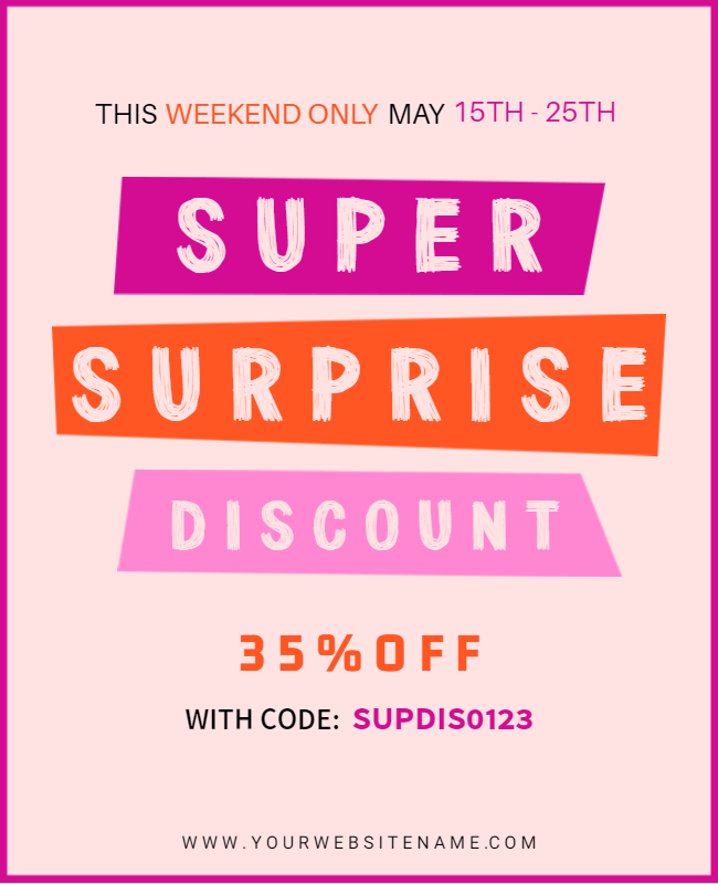
Too many fonts in a Flyer Design
The first thing that should strike your mind while designing anything is the type of fonts you’ll use. It defines the tone, hierarchy & aesthetics of the overall design.
It’s a good idea to stick to two or three font styles as maximum font combinations per design. However, nobody ever extended this further that you can use as many as you want until it looks professionally sane.
Combining two fonts in the key text & utilizing a sober font combination in paragraph text is still a winning idea. All you need is to have a deep understanding of the font styles that are better together & what you should do to make them look stunning.
We’re sure you’ll rethink this.
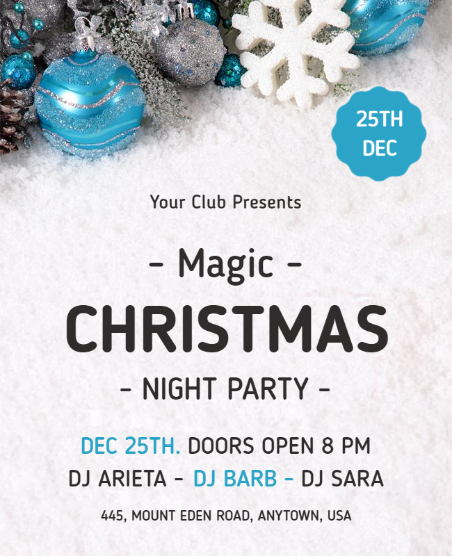
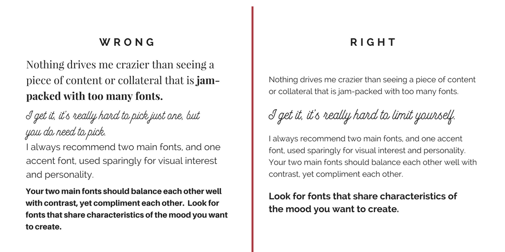
Also, if you’re someone who’ll rather go with the rules then the best recommendation for you is to use font styles that belong to the same typeface family. Here is an instance for you.
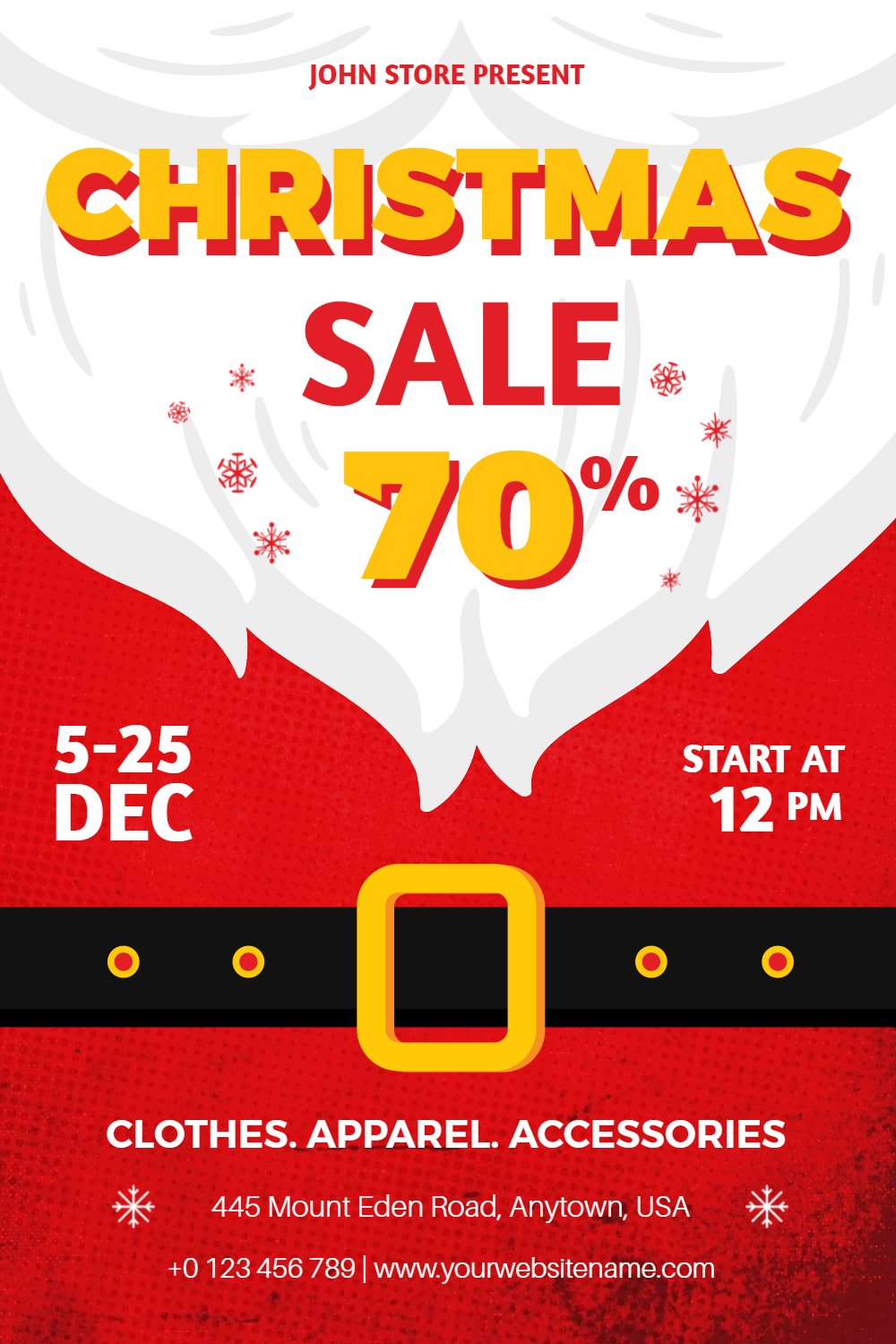
source: blog.photoadking.com
One more thing to keep in mind is the weight, contrast & size of the fonts to ensure that they belong to the same theme. For instance, if you’re promoting a creative flyer, it would be an injustice to use ultimately professional Serif fonts, isn’t it?
-
Uneven Edges
Carelessly ragging edges are signs of an unprofessional designing approach. Aligning text properly in the overall document considering the edges, kerning & leading spaces is the secret to well-justified text. Add proper spacing between lines & paragraphs for a clutter-free reading experience.
The best way to avoid this mistake is to judge your design from the angle of an end-user instead of a designer.
-
Opting for hindering contrasts
Hindering contrasts are the dead-end of your overall flyer design. You may not count it as one of the typography mistakes in flyers, but it is! All your flyer design efforts are in vain, at once.

You should consciously use font colors & set their tones according to the backdrop contrasts. The simple logic is: Text should be clear-readable. It’s accepted even if you make it less creative. The idea is to solve the purpose & impact of the target audience positively.
You may deal with two instances in common, either the backdrop is high-contrast or low saturated. This defines the color palette you should use for your body text. If you win at this, you win the game.
-
Urging for paid fonts only to stand unique
You’re allowed to be fancy or go overboard to choose extravagant & unique fonts. But, this should not limit your choices. Frankly, nobody is going to slam you if you pick freebie fonts instead of purchasing lavishly costing font packages.
After all, Google Font library has millions of fonts for you. If this is less, PhotoADKing brings you a huge collection of fonts to choose from. Feel free to choose default fonts in pre-made flyer templates or go with beautiful & sleek design fonts that don’t cost you $$.
If your flyer idea is unique, readers are likely to care less about your paid or free fonts but will praise your efforts only.
-
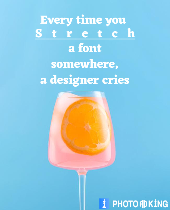
Unnecessary Typeface Stretching
Stretching distorts the balance. It’s better to go without squishing or stretching to maintain the weight of the design.
Unnecessary stretching fonts will only make an awkward appeal. If you don’t know how to do it like a pro, you better avoid doing it. Also, if you can’t keep yourself from stretching fonts horizontally, don’t go for more than 3%. You also need to keep an eye on how your text appears by each other.
ohh wait, are you still confused about designing a flyer? Here is the best solution I can give. check out everything about how to create a flyer.
-
Dense & Stressed Linings & Letter spaces
If it isn’t easy on the eyes of readers, it’s going to be ignored. Be very specific about the in-line spacing & the number of words that you place together.
The ideal words per paragraph for a mess-free look are 50 characters. Readers should not feel like there is too much to read. After all, nobody has that much time in this faster-moving world to stop-by & read line to line. Most importantly, you should know that the beginning text should be extremely creative & engaging for anyone to understand & show interest in your flyer.
-
Centering Text for “No Reason”
This isn’t your school essay competition, but you’re presenting yourself on a professional basis. Unnecessary text centering spoils your impression too.
If you want to highlight something, it should make sense to center it. Moreover, you should not keep centering text twice or thrice. It should be purposely attempted only once. You may wonder why we’re not letting you do so. Well, because it creates an imbalance in readability & you’ll not want this to happen.
-
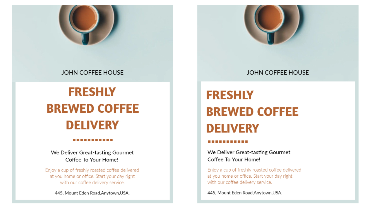
Sizing every word in a similar fashion
Not every word on your flyer holds the same importance. You have headers in CAPS, sub-headers in a smaller-size than the header & the body text in a smaller yet readable font size. Additionally, if you have any dialogue-bubble or quote to display, it should pop-up in a different size to grab the attention.
Make sure everything isn’t sized the same. Follow professional standards to size fonts properly to achieve the final appeal, just as it should be.

-
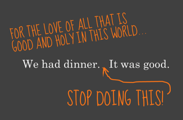
Putting a double space after full-stop
Please don’t do this, for God’s sake! It’s like reversing the era to the 40s. Double-spacing after full-stop only happened with a typewriter & it’s not happening anywhere these days. Even an extra blank space creates a hole in flyer design & turns out to be one of the most common typography mistakes that didn’t spare you too.
-
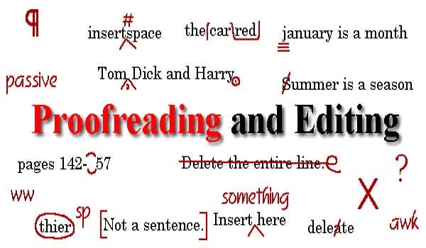
Forgetting to Proofread
What’s left when everything is on-point? Proofread! You must never finalize your flyer without proofreading every single word on it. Also, this proofreading isn’t limited to spelling errors, if your flyer has got numbers, and then double-check them too. Besides this, check if you haven’t left any symbol or unnecessary spacing in your design.
These are just a few things to say, the rest depends on how well you can analyze your design & how accurately you’re at correcting them before printing or sharing the job.
Wrapping it up!
Don’t get discouraged if you’ve made any of the above-mentioned mistakes in the flyer or graphic designing. Just make sure you put a cross over it from now onwards by getting more about flyer design ideas. This will make you stand among the most seasoned professional graphic designers. Take Pride!
At the end of the day, you may be reading a lot of tips & tricks, but when you’re up for designing, you may hardly remember some. If you’re smart enough to break the rules & come-up with a better solution, go ahead! Make sure your flyer turns out appealing.